
Wednesday, December 19, 2012

Tuesday, December 18, 2012


Friday, December 14, 2012

Thursday, December 13, 2012


Wednesday, December 12, 2012

Tuesday, December 11, 2012


Monday, December 10, 2012

Tuesday, December 4, 2012

Monday, December 3, 2012

Wednesday, November 28, 2012
Cinemagraph PLAN
1) For the first one I'll take pictures of someone's face with their eyebrows moving up and down
2) someone throwing a ball up and down but only the ball moves
2) someone throwing a ball up and down but only the ball moves
Tuesday, November 20, 2012
Symbol Tutorial

Friday, November 16, 2012

Thursday, November 15, 2012

Wednesday, November 14, 2012


I chose to create two alternate covers for The Great Gatsby. You may be wondering, "How do these pictures relate to The Great Gatsby at all???????" WELL. For the first one, the creature on top is, of course, Gatsby. The bigger one on bottom is Tom, and the smaller one is Daisy. Nobody really ends up happy in the end of the book, so that's why they are all unhappy looking. Gatsby spends all his time trying to win Daisy over, but in the end she stays with Tom, which is why they are together on bottom. For the second one, there's a picture of the sun. Just before the climax of the book, all of the characters are downtown on the hottest day of the summer. Tensions rise due in part to the heat and an argument occurs, setting in motion the most pivotal events of the book. Both of these pictures represent very important elements of the book.
Tuesday, October 30, 2012
Gift cardz


1. The theme of my gift card is pizza :-)
2. My color palette was limited to only pizza colors, in addition to the black text.
5. I used text sparingly in these gift cards, because gift cards are usually pretty simple and not to crowded. I put the logo in the corner and the text in the opposite corner.
6. The font I used was a pretty standard serif font. It looks pretty nice, I think
Monday, October 29, 2012

Thursday, October 25, 2012

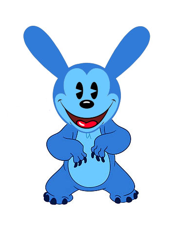
3. Incorporating the Highlights logo, my character, and the Lilo and Stitch concept art into the magazine worked, but thinking of article titles did not :'(
4. If I were to do this project over again I would make a different character because making a magazine out of this one didn't work out so well
5. The most difficult part of this piece was the article titles, for sure. I couldn't think of any
Monday, October 22, 2012

Friday, October 19, 2012


Okay so this installation is definitely my favorite so far. The freedom we had with the project was endless. The point of the project was to project an image or video onto a surface, and what we ended up doing was taking an old television and two old computer monitors and projecting a different video onto each surface. Outside of the projection part of the project, we used physical materials to reflect what was in the videos we were projecting. Audio-wise, we had one of the videos playing at full volume while we played Animal Collective in the background. We all really liked the concept of what we were doing with this project and we got pretty experimental with it. We really just let our ideas flow freely on this one and I think it definitely payed off. Once the whole thing was put together it created a really cool atmosphere and I'm definitely very happy with the final result. There is a longer video on Erin's blog at http://apex-2013-erin.blogspot.com/2012/10/weather-station-installation.html
Disney-mal
Subscribe to:
Posts (Atom)